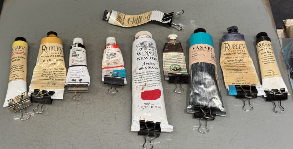
These are the paints that I ALWAYS have out on my palette. I know them more than any other colors. I am 100% familiar with their personalities, so I don’t have to think when I’m mixing.
Please note: I no longer use Harding paints due to an experience in which their paints were causing excessive beading up when oiling in or varnishing and they were not responsive or helpful in trying to find out the cause (revealing any additives, etc)
This is also how I lay them out on my palette in order:

| Color | Preferred Brand | Qaulities |
| Cadmium Yellow Medium | Natural Pigments | Yellow – light value, high chroma, slow/medium drying, opaque, cool/neutral yellow, strong tinting |
| Yellow Ochre | Rublev (Blue Ridge Yellow Ochre) | Yellow – mid value, mid chroma, fast-ish drying, semi-opaque, warm yellow, weak tinting |
| Raw Umber | Old Holland or Holbein | Yellow – low value, low chroma, semi-transparent, fast drying, greenish yellow, weak tinting |
| Cadmium Red Light | Holbein | Red – mid value, high chroma, slow/medium drying, opaque, orange-ish red, strong tinting |
| Alizarin Crimson Permanent | Winsor Newton | Red – low value, high chroma, slow drying, transparent, cool purple-ish red, REALY STRONG tinting |
| Burnt Umber | Old Holland? | Red – low value, low chroma, fast drying, opaque, orange-ish, weak tinting |
| Cobalt Turqoise Bright | Vasari is expensive but Winsor Newton Cobalt Turquoise Light is a good substitute. | Blue – mid value, high chroma, medium drying time, greenish blue, generally opaque, medium tinting |
| Ultramarine Blue | Rublev/Natural Pigments | Blue – low value, high chroma, slow drying, warm purplish blue, transparent-ish, strong tinting |
| Ivory Black | Rublev/Natural Pigments | Blue – Low Value, Low Chroma, slow drying, transparent-ish, medium tinting |
THE ONLY 3 MEASURABLE DIMENSIONS OF COLOR
- Hue (The color family… red? Blue? yellow?)
- Value (How light or dark the color is)
- Chroma (How intense the color is, how vibrant or saturated it is)
WARM and COOL are relative terms. They describe a relationship between two things. They are not measurable quantities.
WHITES
I almost exclusively use lead white. My preferred brands are Natural Pigments #1 (made with linseed oil) or #2 (made with walnut oil) and Old Holland. Here’s how general whites differ depending on the pigment itself:
| LEAD WHITE | TITANIUM WHITE | ZINC WHITE |
| Warm | Cool | Don’t |
| Fast Drying | Slow drying | Don’t |
| Strong Paint film | Strong Paint film | Don’t |
| Weak tinting | BULLY | Don’t |
| Plays well with colors | Overwhelms color and drops chroma (pasty) | Don’t |
If you use titanium white, beware of “voodoo darkening”. This is a somewhat unexplained phenomenon in which certain titanium mixtures dry darker than they appear when wet. This can make matching a color, or patching areas almost impossible. The titanium that does this the least is Gamblin’s Flake White Replacement. This is a titanium white that they have added bodied linseed oil so it acts more like lead. It is still a titanium and in terms of color mixing still acts much like a full titanium.
Special Guests
If I need to open up my gamut, or color capabilities, I may need to bring in a special guest. Common special guests are:
Lemon Yellow (A very very light cool yellow),
Pthalo Blue (a very chromatic, dark, greenish blue, slow drying)
Prussian Blue (a very chromatic dark greenish blue, but earthier than Pthalo, also a VERY fast drying color)
M. Graham’s Quinacrodone Rose (very chromatic, light in value, cool red, very transparent)
Winsor Newton Bright Red (a Chromatic red, similar to cad red)
Cadmium Orange (no brand preference, very chromatic and opaque)
Todd Herzog
I find Gamblin Cobalt Teal to be a good substitute for the Vasari at a much lower cost. And same color index.
Suzanne Batchelor
Same comment as Todd Herzog…I am studying color ATM and was mixing Gamblin Cobalt Teal and it stood up perfectly to the often touted “Williamsburg Cobalt Teal Bluish” from Munsellites.
Susanna Anastasia
Julie you are a magnificent painter! I will be the first to nominate you for the Metropolitan Museum of Art, unless you are there already there! Thank you for sharing your work with the public and artists alike, as viewed on your homepage.
uc satın al
It is very comforting to see that others are suffering from the same problem as you, wow!