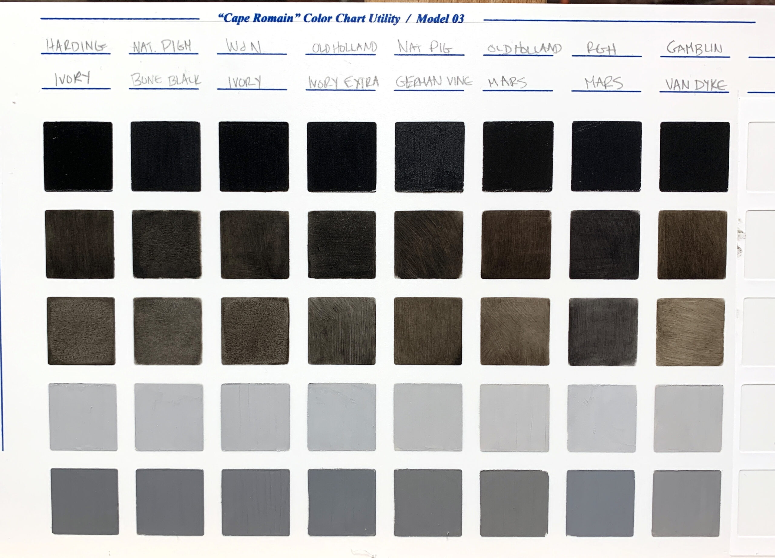
Chronicling all of my paints compared to each other. This is how I become familiar with my paint personalities and know how they will work in my regular painting practice. You can find these cool boards to do your own here.
Testing squares are:
1. Fully Opaque – out of the tube
2. Slightly transparent – I try to just scrub the dry paint evenly. If the paint is too dry to do this I MAY add a tiny bit of oil to encourage transparency.
3. very transparent – I try to just scrub the dry paint evenly. If the paint is too dry to do this I MAY add a tiny bit of oil to encourage transparency.
4. Value 2 mixed with white – The White used is Natural Pigments Lead White #1.
5. Value 5 mixed with white – The White used is Natural Pigments Lead White #1.
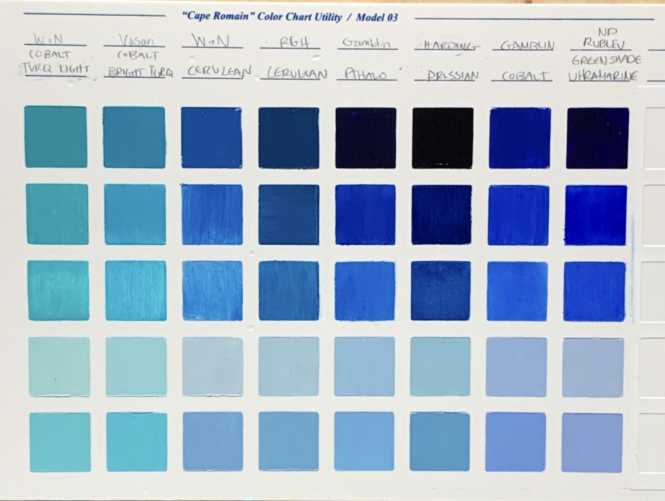
| Brand | Consistency Out of the Tube | Easy to Glaze/Spread | Temperature | Drying Time |
|---|---|---|---|---|
| Winsor Newton Cobalt Turquoise Light | Buttery smooth, opaque | Not really | Greenish | Medium |
| Vasari Cobalt Bright Turquoise | Buttery Smooth, semi transparent | Yes, no oil needed | Greenish | Medium |
| Winsor Newton Cerulean | yuck – super dry and pasty | def needed oil, still yuck | Warmer/purpleish | ? |
| RGH Cerulean | Pasty-ish but workkable | Fabulous chroma and spreading with a tiny bit of oil | Greenish | ? |
| Gamblin Pthalo Blue | Soft/stiff | Added a bit of oil and then it was nice to glaze with | neutral blue? | slow |
| Harding Prussian Blue (INCREDIBLY STRONG TINTING) | Smooth | tiny bit of oil needed but great coverage | Greenish | FAST |
| Gamblin Cobalt Blue | Stiff/Dry/Opaque | good coverage with a tiny bit of oil added | Purplish | Medium |
| Rublev/Natural Pigments Ultramarine Blue | Smooth, Sticky | Good coverage with a tiny bit of oil added | purplish | Slow |
My standard palette includes the Rublev Ultramarine Blue and Vasari Cobalt Bright Turquoise. The Prussian blue is a super fast drying paint so sometimes I’ll use that for dark blues in a first pass.
David B
Hi Julie, I’m confused about testing squares 4 and 5…
4 is value 2 with white…
5 is value ? with white… looks like value 1, i.e., right out of the tube?