There are many painters whose work I enjoy, who seem to be able to “find” the painting or are able to push the work into different directions through the painting process. I am not what you would call an “improvisational painter” who uses my gut reaction to things while I’m painting. I typically have most things planned out in advance. My improv times are during the idea development and set-up, which is all pre-painting.
I also have a serious case of FOMO (fear of missing out) which means I am always assuming I’m missing out on some amazing capability or experience so I try painting experiments off to the side to see if there’s anything I discover that I want to bring back to my regular practice. This is one of those cases where I was going to try to give myself zero parameters and see what happens.
I took one of the transfers I was going to use for another painting, and transferred it to a canvas and decided to just “wing it.” What you see below in the animation is the evolution of that. I will describe each attempt and rate how much I liked it at that point and how I felt about it.
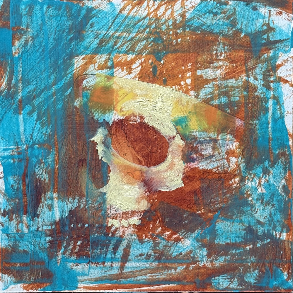
First and second session:
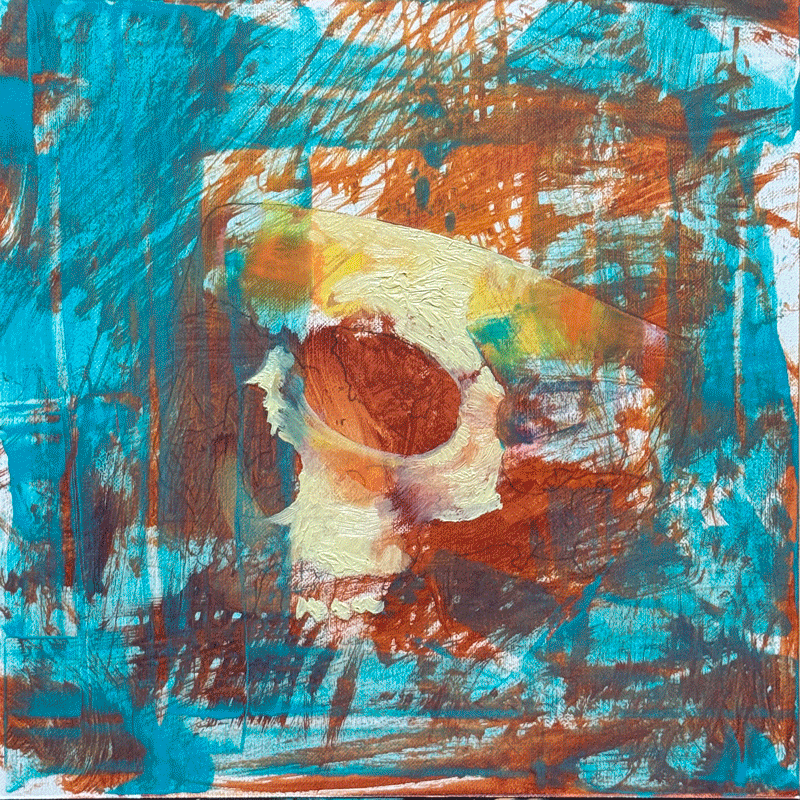
The first session I just washed some random warm colors across it using a fan brush. I didn’t get a picture of this but it’s the orange color you see under the blue. The second session I used a paint shaper to apply some blue thinned out paint and and then added a bunch of impasto medium to a light color to block in parts of the skull. I almost never use extreme texture so this was going to be interesting.
Rated 0/10 – I hate it but didn’t want to just keep adding more paint so I’m going to let it dry to do more on top.
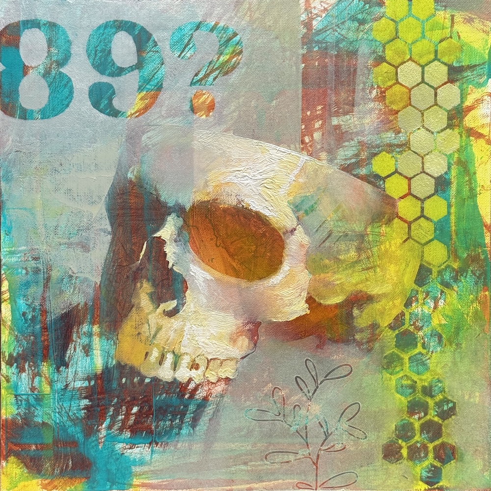
Third session:
Using mostly just straight paint, I stared adding the neon yellow with some stencils and glazing but then I felt like it was just turning into a crazy chromatic mess. I tried adding in additional neutral greys. I used a little palette knife action to define the left side of the skull and reverse-added the numbers. I also glazed some oranges and yellows onto the texture. Again, just kind of winging it and not sure what i’m doing.
Rated 3/10 – It looks kind of hacky and random. There are a couple spots I like the paint effects but nothing I feel is anywhere close to a direction.
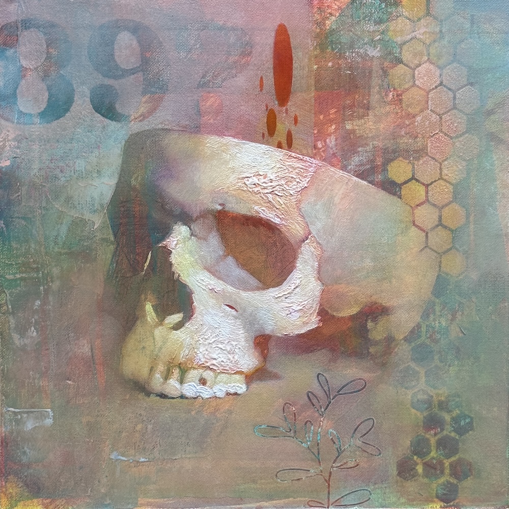
Fourth session:
The crazy chroma was annoying me so you can see a lot of scumbling/neutralizing/unifying going on here. I also did a bit of glazing pinks onto the skull and then wiping away. I liked the effect from the first iteration of the blue paint kind of being elevated out fo the skull so I recreated that with red. While inherently less hacky, it is a bit more boring. I’m using too many randomy styles or approaches to the skull but my colors are now pendulum swinging back to reality, which may or may not be a good thing.
The interaction between transparent layers are hard to predict. This is what I would call “complex color” rather that simple clear opaque color that was mixed on my palette and put down cleanly and opaquely. That type of color can be perfectly matched in another layer if needed. Complex color is impossible to perfectly match because you are seeing multiple colors at once through layers. However, if a process like this I’m not matching anything so that doesn’t matter to me in this painting.
Rated 4/10 – Meh, the onyl part I kind of like is the left side of the skull against the background.
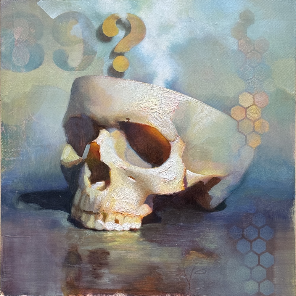
Fifth session:
I felt like I was just going to keep going in circles because I had no clear direction, intention, or end in sight so I decided to limit my palette of colors in order to bring some focus. Color is a huge factor for me and I thought this at least limits the variables I’m working with. I’m hoping tt might free up my brain to do better things. I found this image of an older painting (Cardiff Docks by Lionel Walden) and decided this was going to be my inspirational palette.

I simplified a lot of this and put the skull in a more believable space. While it wasn’t sitting on a box like it was in my reference, even just anchoring it to a ground plane felt so much better. I think diverting too far from realism is a thing I try often but keep finding my way back here. I still really enjoyed the alignments of the hexagons with the back of the skull so I’m trying to retain that. While I lost the red dots emerging from the skull, I took the “steam” idea from the inspirational palette painting and added that instead.
Rated 6/10 – The color harmony at least made me feel better about this.
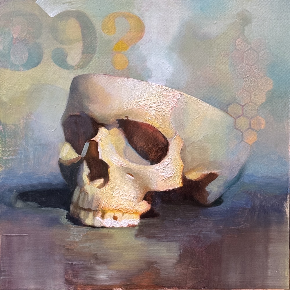
Sixth session:
At this point I’m just building smaller changes onto the previous version. I’m making the reflection read better, adding values to effects to the steam, and brought in a little play with the question mark and 3rd space.
Rated 7.5/10 – I think I’ve squeezed everything out of this that I can.
In Conclusion
The goal of this is not the final painting, but the experience of a new process. If I could go back and do this specific painting again, I might:
- not have done the impasto texture so early
- limited my palette earlier
- try a water based media for early layers so I could have more immediate layering possibilities
- focused my experimentation more about the layering
Happy painting!
Gabrielle Tucker
Thanky for sharing
Love process shots n explaining experience of it
Tim
I’ve just seen some of your work and it’s exceptional indeed. 🎨 I’ve been still life painting for a hobby and love realism 🎨 you have a great pallete of colour, I must try harder and also try to get inspiration too. 😎 Thank you 👍
AnnDrea Boe
Thank you for sharing your process along with your transparent honesty while completing this painting. I appreciate your discipline and ability to decipher what you need do in order call it finished – something I need to improve for my own work. The final painting is gorgeous!!